
Building an identity system for a university-wide WordPress rollout
How do you create components that serve dozens of departments — without making everyone feel like they're wearing the same outfit?
Project: Create a Wordpress theme and components in Figma | Organization: University of California, Santa Cruz | My Role: UX Designer
The Challenge
A university isn't one thing. Neither is its website. We needed a design system that let every department feel like itself — while still feeling like UC Santa Cruz. The campus has all the magic of Northern California: ocean views, mountains, and meandering forest paths where one might spot whimsical student art projects. But it's also a strong place known for its student activism, commitment to social justice, and rigorous academics.
How do you balance those two things in a design system? The challenge was to create something spacious and free, yet powerful. It needed to do it in a way that worked across dozens of departments, each with its own unique identity and audience.
Migrating to a new WordPress platform was both the trigger and the opportunity for a redesign. The goal was to create a Wordpress theme and component library that met everyone’s diverse needs, yet kept everyone’s site professional, usable, and accessible.
How to build a design system
We followed the theory of atomic design: start with the smallest elements and work up. The atoms (typography and colors) needed to follow the university identity system. We combined these atoms to form molecules: buttons, tables, cards, and other patterns. Those molecules could be assembled into page templates and patterns that worked across the university's diverse digital landscape.
Atoms
Color Styles
The first step in Figma was to create the team color styles. We needed to add a gray palette the brand system didn't originally have, for background colors. We also named the tertiary colors “Pacific Blue” and “Ocean Blue” making them easier to refer to.
Color combination accessibility chart
This chart showed what colors could be used in combination and still have sufficient color contrast. There were hundreds of different web site owners with varying levels of technical proficiency. We wanted to allow people to make creative choices, as long as they were accessible! So baking accessibility into the components was key.
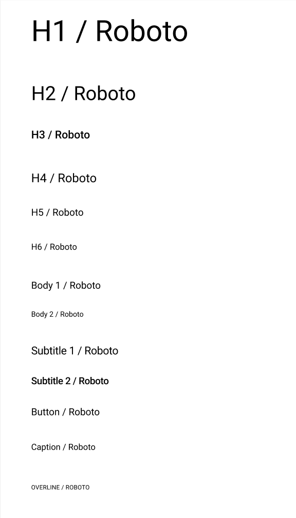
Typography: Roboto was an airy, readable, and professional typeface that worked for headlines and copy
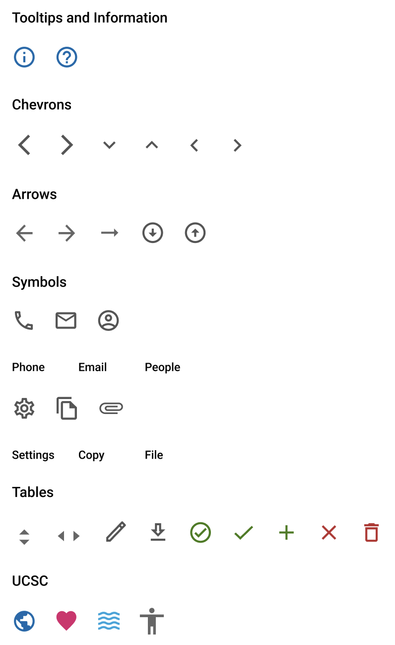
Icons
We used Google Material Icons because its minimalistic design worked well with Roboto, it was flexible, and provided a lot of options. Some icons that represented UCSC’s spirit were included, the globe, heart, waves, and person.
Molecules
Header
We needed to draw a clear line between what was consistent and what could flex. The universal header provided consistency, but the departments were able to have control over the main navigation and header.
A tiny banana slug (the university mascot) added a touch of whimsey to the footer. The universal footer also provided balance and continuity.
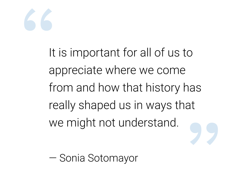
Quotes
So many use cases…
The trickiest problem wasn't the design system, but all the use cases it had to address. University departments have real and legitimate reasons to look different from each other.
The system needed to work for both a home page
and an enterprise application page with a table.
Outcomes
The university successfully migrated to the new WordPress platform, which remains live today. Several core elements from the original system have proven durable — the wave header, the footer with the banana slug mascot, and the brand token structure have all outlasted the initial rollout and continue to anchor the university's web presence across departments.
What I'd Do Differently
The biggest lesson came at the handoff between Figma and WordPress. Typography and spacing that looked right in Figma didn't render the same way in the browser. What came out was heavier and tighter than designed, and the workaround was adding more bold text to compensate for lost contrast. It worked, but it was a compromise: the type decisions ended up being reactive rather than deliberate.
If I were doing this today, I'd address this in two ways. First, I'd validate type and spacing in the browser much earlier — testing in the actual rendering environment before finalizing component specs, rather than discovering the gap at handoff. On a system built for dozens of departments, a discrepancy at the atom level compounds across every template and page.
Second, the tooling to close this gap has improved significantly since this project. Figma now has Dev Mode built in, which surfaces exact CSS values, spacing, and typography specs directly to developers without any translation layer. For the Figma-to-WordPress pipeline specifically, AI-powered plugins like transjt and UiChemy can now convert Figma components directly into WordPress-compatible code — recognizing layout patterns, generating responsive breakpoints, and exporting design tokens as CSS variables rather than static values. The type-rendering problem we solved manually is increasingly something that gets caught and corrected in the export step itself.
The core lesson still stands: design systems need to be validated in the environment they'll actually live in. But today I'd have better tools to catch it earlier.
Putting everything together
Atoms, molecules, and organisms form actual pages.
Here we showed how the Arts department was able to retain their logo and branding.
Art Division web site
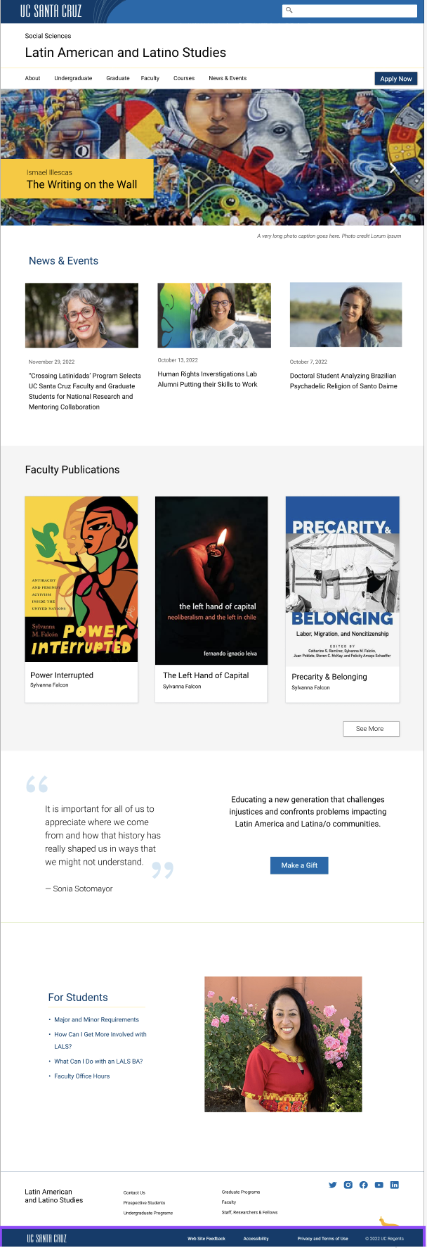
A departmental web site utilizes cards, quotes, buttons, and more.
An article page - many departments had text heavy sites, so the typography needed to be very readable.
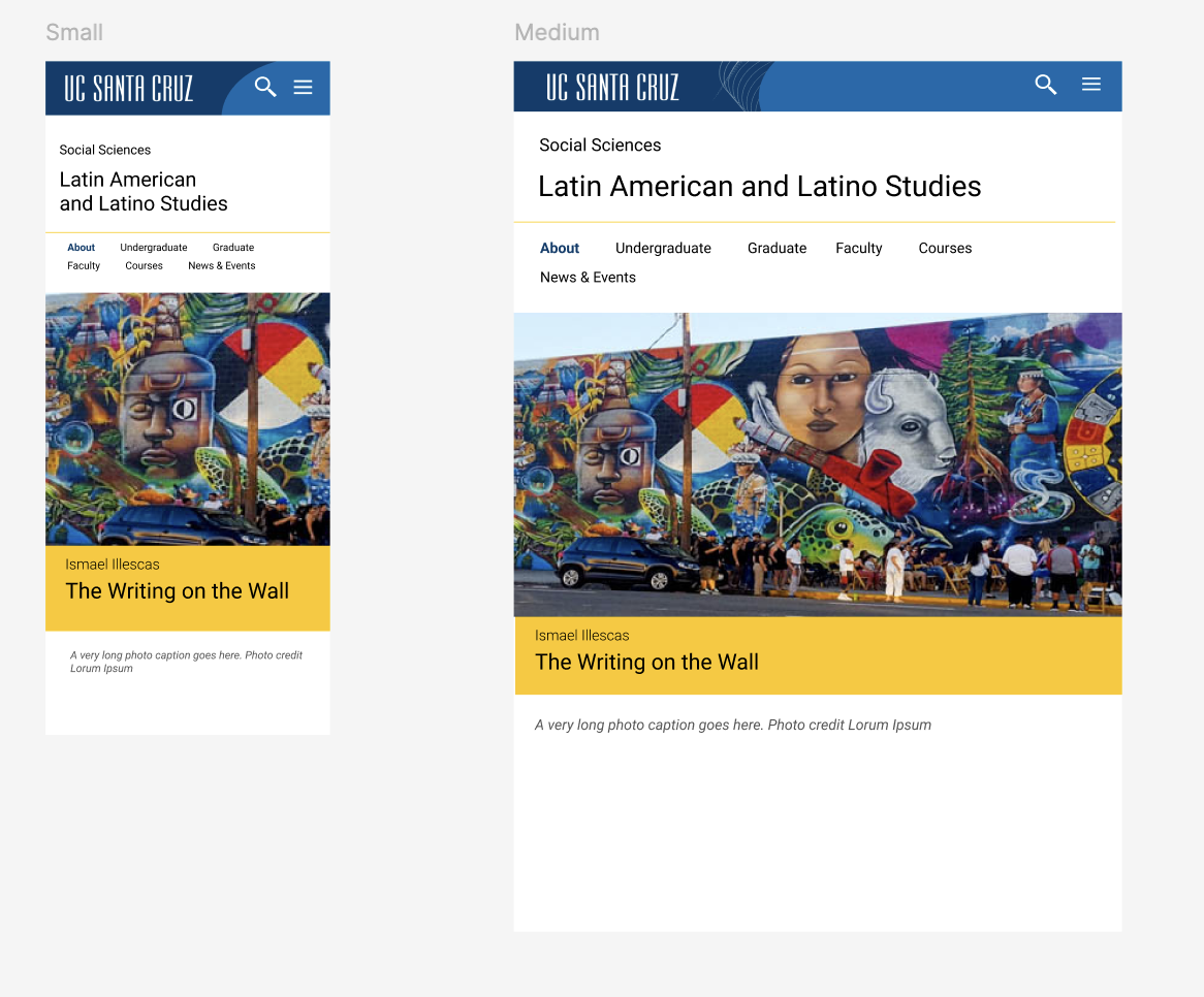
The responsive design at different screen widths. We set the break points and grid system in Figma, but they didn’t carry over to WordPress.
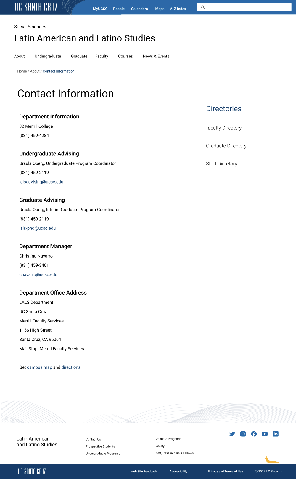
Contact information page