
Building an identity system for a university-wide WordPress rollout
How do you create components that serve dozens of departments — without making everyone feel like they're wearing the same outfit?

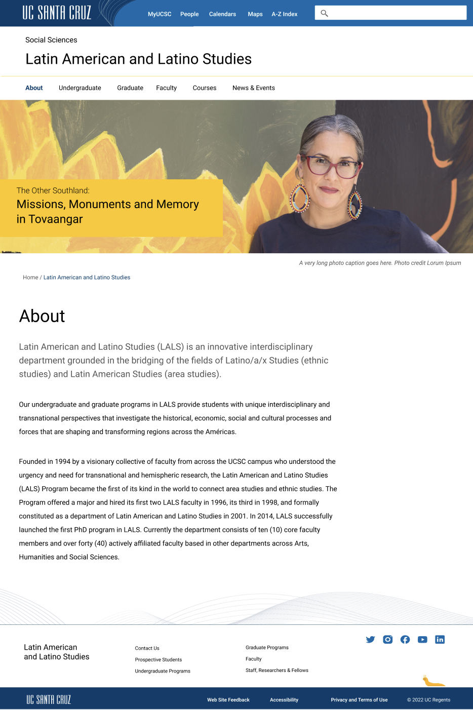
A vibrant home page for an academic division.
The Challenge
The University of California Santa Cruz needed a WordPress theme that reflected its unique and gorgeous soul. The campus has all the magic of Northern California: ocean views, mountains, and meandering forest paths where one might spot whimsical student art projects. But it's also a strong place known for its student activism, commitment to social justice, and rigorous academics.
How do you balance those two things in a design system? The challenge was to create something spacious and free, yet powerful. It needed to do it in a way that worked across dozens of departments, each with its own unique identity and audience.
Migrating to a new WordPress platform was both the trigger and the opportunity for a redesign. The goal was to create a Wordpress theme and component library that met everyone’s diverse needs, yet kept everyone’s site professional, usable, and accessible.
How We Built It
We followed the theory of atomic design: start with the smallest elements and work up. The atoms (typography and colors) were all pre-determined by the university identity system, although we needed to add a greytone pallette. We combined these elements to form molecules: buttons, tables, cards, and other patterns. Those molecules could be assembled into page templates and patterns that worked across the university's diverse digital landscape.
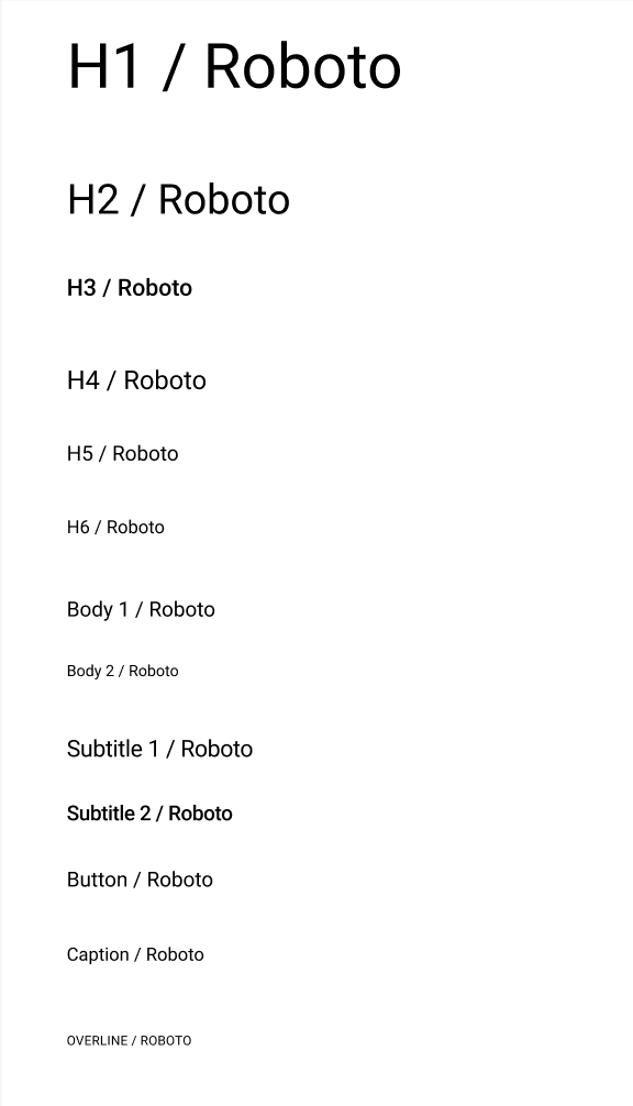
Typography
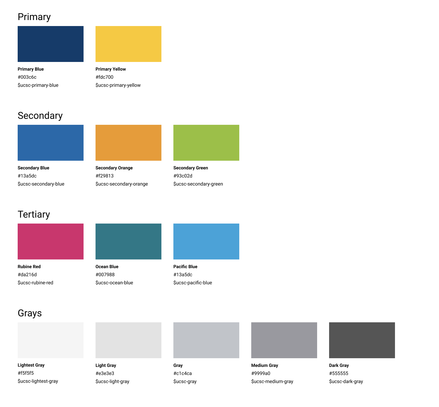
Color components
We built the identity system in Figma so that multiple designers could work on it at the same time, and the HTML styles were easily accessible to developers. Accessibility and responsive design was built in from the start.
The Hard Part
The trickiest problem wasn't the design system, but all the use cases it had to address. University departments have real and legitimate reasons to look different from each other. The Admissions web site has a much different purpose than the HR site. There are also hundreds of different web site owners with varying levels of technical proficiency.
We needed to draw a clear line between what had to be consistent and what could flex. The universal header, footer, and the brand tokens were non-negotiable. They make the university feel like one institution across a diverse digital landscape. But beyond that the goal was to create flexible components that could be mixed and matched and allow each department to have its own distinct personality and style.
The goal wasn't to make every site look the same, it was to make every site look like it belonged to the same university, and to make building them faster and less error-prone. We wanted to allow people to make creative choices, as long as they were accessible! So baking in good design choices and accessibilty was key.
The result was an airy and beautiful component library that worked across a diverse digital landscape. Although this design system has changed throughout the years, many distinctive elements remain, such as the slug on the footer.
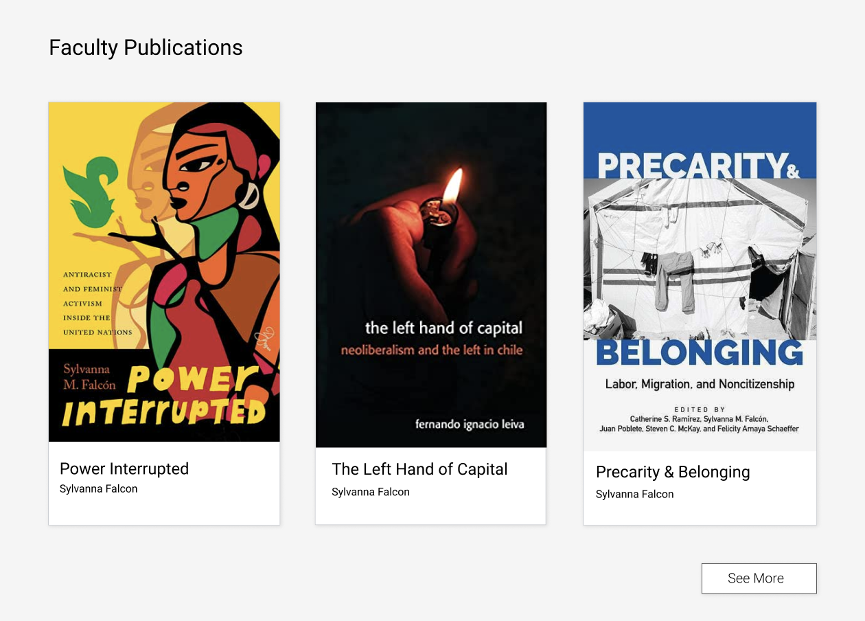
Cards can be used with a variety of images for different visual impact.
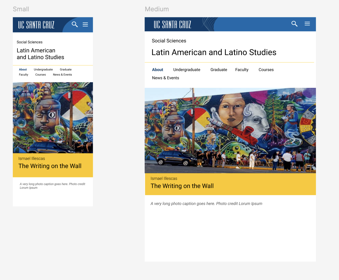
The responsive design at different screen widths.
An example of a departmental website.