Using Illustration as Points of Delight
Unexpected Happiness in the Opus Application
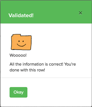
When you're building an an enterprise application for a university, the last thing your users expect is a little bit of humor. In this case, our users had to go through some data and "validate" it as correct. Not a very fun task. Perhaps it was such an un-fun task that people were extra surprised to see this happy little green modal after each successful validation.
It was a little bit of a risk, as people at the university are used to their computer applications being very, very serious! Unexpected delights happen when using Pinterest or MailChimp, but not in a university web site.
But people loved seeing this little modal! As I found out by reading the questions in our help desk, the users started calling it "the woooo." "I didn't get the woooo." or "I know I did it right because I saw the woooo." or "I love the woooo!"
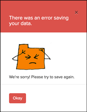
This little red error modal appeared when something went wrong in the validation process. The message reassured the user that it wasn't their fault, took responsibility for the error, acknowledged the frustration it caused, and asked them to save again.
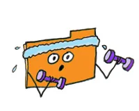
Illustrations also let the users know what they can do on the site:

Clean Your Data
View Active Cases

Create a Data Summary
Calculate your Eligibility for a Promotion
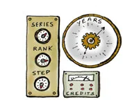
And what features are coming up next:

"The woooo" became something I think about every time our UX team hits a moment where the safe choice is to be serious and the right choice is to be human. UX isn't decoration. It's a signal of care. Enterprise software at a university is not supposed to have personality. But taking that risk taught me something more valuable than any usability test: when you treat users like people instead of task-completers, they appreciate it. They love the wooooo.