How Pokemon Go Inspired a job app’s Design
Love it or hate it, there’s something about Pokemon Go. The tasks are useless. There are no rewards. Yet I still love it.
I was working on my latest freelance project, and I was wondering how could we transfer this kind of behavior something that really mattered like, looking for a job? Shouldn't opening a new job offer be as fun as hatching an egg in Pokémon Go? It should be. It's a lot more meaningful!
Hatching an egg:
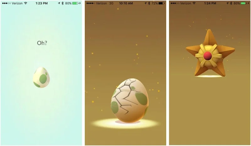
An egg hatches to reveal what kind of Pokemon is inside.
Receiving a job offer:

I have a new job offer... what will it be?
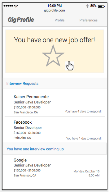
I click to find out. The job offer opens!
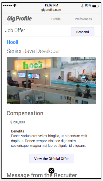
The big reveal... it's a job offer from Hooli!
I started to notice all the different ways that Pokémon go made their navigation so easy. It wasn't like a site map at all. It was more like a series of shortcuts that opened up an overlay modal. When you were done, you went back to the main action. Instead of thinking of the site structure as a "map", I started to think of our app as a main screen with overlay screens.
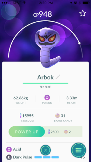
Pokemon screen
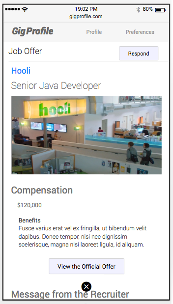
Job offer screen. Like Pokemon go, you can go back to the main screen by clicking on the "x" at the bottom of the screen.
As UX practitioners, we can learn a lot from games, because game apps are so easy to play! In this case a job search is a serious thing, and we respect that. But if we can make the onboarding a bit more fun, it will bring more adoption.